
People use italics. Italics show which words or phrases are important. Readers can focus on the key points. The post becomes easier to read. This style works well on LinkedIn because people scan posts quickly.
LinkedIn does not give an italic button. The post editor only supports plain text. This is why many users copy italic-style text from Aim IT Solution Linkedin Text Formatter Tool. This tool creates Unicode letters that look like italics. LinkedIn accepts these letters without any issue.
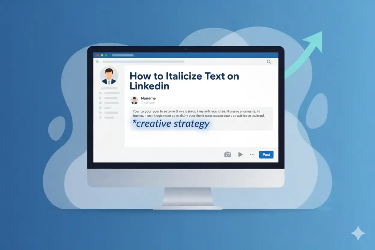
I explain How to Italicize Text on LinkedIn in a practical way. You will see each step in order, and you can use the same method on any device.
What Is Italic Text on LinkedIn?
Italic text shows a slight right tilt. Writers use it to mark a word or phrase that needs attention. Readers understand the shift and pause for a moment. This small change helps the line stand out without looking loud or forced.
People on LinkedIn use italics to highlight key ideas, show quotes, or separate examples from the main message. The style also helps long posts read better because it breaks the text into clear parts. A short italic phrase can guide the reader’s eye and keep the post smooth.
LinkedIn does not provide built-in italics, but the platform shows italic-style Unicode letters correctly. This makes italics a useful option for anyone who wants cleaner and more organized writing on the platform.
Why LinkedIn Doesn’t Offer Native Italic Formatting
LinkedIn keeps its post editor simple. The platform focuses on plain text because it loads fast and works well on all devices. LinkedIn avoids extra buttons like italic, underline, or different fonts because these features can break the layout across mobile and desktop.
LinkedIn also wants consistent posts. When every user follows the same format, the feed stays clean, and people can read updates without distractions. Extra styling options can create mixed designs, and LinkedIn wants to avoid that.
Because of this, LinkedIn supports only basic Unicode characters. Users copy italic-style Unicode letters from converters, and LinkedIn shows them without any issue. This method works because it does not change the platform’s structure or design rules.
How to Italicize Text on LinkedIn (Step-by-Step)
LinkedIn doesn’t provide a button for italics, so the only solution left is the copying of slanted Unicode letters. You are to follow the steps below for the whole process.
Step 1: Open a simple text converter
You will be opening a converter page in your web browser. The page typically contains one input box for text and another one for output.
Step 2: Type the word you want to tilt
You type the word or short line you want to highlight. The tool shows the same text in slanted Unicode letters.
Step 3: Copy the slanted text
You copy the character version that is slanted. These letters are just like normal ones, hence LinkedIn accepts them.
Step 4: Paste text into LinkedIn
You paste the text that you copied into your post, comment, or article. The letters remain slanted.
Step 5: Check the line
You read the line through. You check that the text is nicely placed in the sentence and does not look forced.
Step 6: Post the message
You complete your message and hit the post button. The slanted words give a tiny visual break and help your point to become more noticeable.
Best LinkedIn Italic Generator (Free Tool)
Many users rely on a basic italic generator because LinkedIn does not offer built-in text styling. A good generator keeps the process quick and clean. It creates slanted Unicode letters that work on all devices and do not break the layout of a post.
A simple generator shows two boxes. You type your text in the first box. The second box shows the slanted version. You copy that version and paste it into LinkedIn. The letters stay the same because they act like standard characters.
A reliable tool should load fast, keep the text readable, and avoid extra symbols. It should also keep the spacing clear so the text blends well in a sentence. This helps you create small highlights without changing the tone of your post.
How to Use LinkedIn Formatting Tools the Right Way
Formatting helps you keep a post clear. You use it to show structure, not to change the whole look of the text.
You can use italics when you want to mark a short phrase or a quick quote. You can use bold when you want to point to a key line or a small heading. Line breaks also help because they give the reader space to follow each point.
You should avoid mixing too many styles. If every line has a different look, the post feels busy and hard to read. A simple layout works better on LinkedIn because people skim most posts.
You should also check the post on your phone before you publish it. Mobile screens show spacing differently, and a quick check keeps the format steady.
LinkedIn Formatting Mistakes to Avoid
People often use formatting to make a post look different, but some choices can reduce clarity. A few common mistakes are easy to avoid.
You add too many styles in one post.
If you mix italics, bold, symbols, and long gaps, the post loses its flow. Readers skip lines when they see too much styling.
You tilt long sentences.
Italics work best for short words or phrases. Long tilted lines are hard to read and can look uneven on mobile.
You paste text without checking the layout.
Some posts look fine on desktop but break on mobile. A quick check helps you spot spacing issues.
You use styles to replace clear writing.
Formatting should support the message, not hide it. Clear sentences matter more than visual changes.
These small checks help you keep your posts clean and easy to follow.